Graphic Design: Type Based Poster 'Edge'
Project Type
Graphic Design
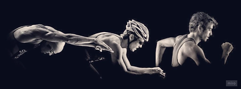
This project is based on designing a bold, typographic poster design for "Edge", a three-day triathlon event, where the word Edge dominates as the hero element, radiating energy, strength, and endurance. The design captures the spirit of competition, determination, and athletic power.
This project was completed as part of the Graphic Design Certificate Course at AND Academy, conducted in collaboration with the Indian Institute of Art and Design (IIAD), Delhi, and Kingston School of Art, Kingston University, London.
Date
April 2023
Welcome to my graphic designing for a type based sports poster.
I love mixing creativity with clean design to make visuals that really connect with people. Keep scrolling to see how I worked on this project!
Technical Skills
Adobe Photoshop
Adobe Illustrator
Miro Board

Project Brief
Design a captivating poster promoting a three-day triathlon event named "Edge," with a primary focus on typography to emphasize the word "Edge" as the hero element of the design. The typography should exude energy, strength, and dynamism, aligning with the endurance and determination required for such a competitive event.
Energetic
Intense
Passionate
Daunting
Challenging
Adrenaline
Thrilling
Extreme
Fun
Fierce

Initial Exploration Sketches
Concept Note
I began with pencil sketches, exploring the typography of "EDGE." I played with curves and straight lines to depict both soft and hard edges.
Transitioning to digital, I refined these sketches to create compelling compositions evoking a sporty feel.
Each iteration aimed to capture the essence of competition and limits through the interaction of letters.

Visual Bank: Crafting A Narrative

Creating a visual bank which brings out the essence of my event through selected colors, textures, typography and symbols that shows the vigor of the competition.

Energy, excitement and fun.
High visibility, fairness, psychological clarity
Stability, professionalism and authority in sports.

Franklin Gothic Demi
Myriad Pro


Motion, Speed
Rugged, Terrain, Endurance
The event
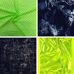
Textures
Creative Development
Stage 1


Stage 2
Revised the posters to make it less lessen textual clutter, and to make the word 'Edge' the hero.
By amplifying the prominence of 'Edge,' the design elevates the triathlon's competitive spirit and challenges, encapsulating the event's intensity and determination.
This visual reconfiguration allowed for a dynamic interplay of negative space.

Added color and texture to bring out the core feeling of the Triathlon based poster.

Stage 3
The deliberate choice of a slanted typography exudes a sense of motion and urgency, echoing the adrenaline-fueled intensity of the triathlon.
By extending both 'E's, top and bottom, a cohesive visual flow is achieved, unifying the typography and reinforcing the poster's energy.
Introducing a grunge texture to the type and triangles injects a raw and rough quality, heightening the poster's visual impact and aligning with the event's adventurous and tough nature.
The inclusion of event details, such as venue and timing, amidst this energetic design, ensures vital information is communicated effectively while maintaining the overall poster's electrifying and captivating essence.
Stage 4: Final
Mockups


