Data Visualization for L'Acier Campaign Strategy
Created a series of five strategic data visualizations using pivot tables to support L'Acier’s digital marketing team in optimizing campaign performance. Used session and conversion data to reveal traffic patterns and conversion rate trends by time and weekday.
Project Type
Data Analytics | Digital Marketing Strategy | Visualization
Date
July 2025

Project Overview
This project was part of a simulation where I played the role of a digital marketing analyst for L'Acier, a fictional brand. My goal was to analyze user behavior patterns from web sessions and conversion data and translate the findings into actionable insights using pivot tables and clear, presentation-ready charts. It was completed as part of my Meta Marketing Analytics on Coursera.
Step 1: Data Preparation
-
Downloaded and reviewed the provided campaign dataset
-
Created pivot tables to summarize data by hour and weekday
Step 2: Chart Creation
Chart 1: Total Sessions by Hour of Day
-
Data: Sessions pivot table
-
Goal: Show patterns in website traffic over a typical day, comparing hourly sessions.
-
Suggested Chart Type: Line chart (for time-based visualization)
.png)
Chart 2: Total Conversions by Hour of Day
-
Type: Column Chart
-
Insight: Conversions spike around 10 AM and again between 7–9 PM, aligning with session traffic peaks.
.png)
Chart 3: Average Conversion Rates by Day of Week
-
Type: Bar Chart
-
Insight: Wednesdays and Mondays showed the highest average conversion rates, suggesting campaign budget should be reallocated to these days.
.png)
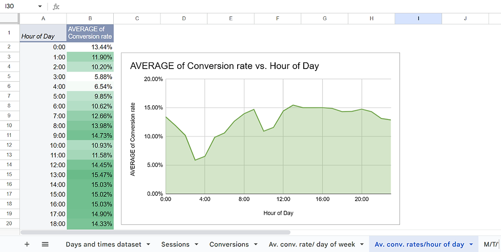
Chart 4: Average Conversion Rate by Hour of Day
-
Type: Area Chart
-
Insight: Conversion rates steadily rise after 8 AM and peak at 10 AM and 8 PM, indicating high-intent user activity.
.png)
Chart 5: Monday–Wednesday Conversion Rates by Hour of Day
-
Type: Grouped Column Chart
-
Insight: Conversion activity is strongest on Wednesday mornings and Monday evenings, further supporting targeted scheduling.
.png)
Step 3: Chart Formatting
-
Title and Labels: Ensure each chart has a clear title and labeled axes for ease of interpretation.
-
Customization: Adjust colors, text sizes, and label placements to make data visually accessible.
Step 4: Review and Adjustments
-
Revisit each chart to ensure that the chosen visualization method conveys the data accurately.
-
Make any necessary adjustments to chart types or formats to maintain consistency.
Step 5: Save and Document
-
Save the final versions of the charts.
-
Document each step and thought process to showcase your analytical approach for future reference.
Key Takeaways
-
Strengthened skills in pivot table creation, chart design, and data storytelling
-
Learned how to identify conversion trends and map them to strategic recommendations
-
Practiced customizing charts to ensure clarity and executive-readiness
-
Gained experience in turning raw analytics into marketing strategy